Quickly making a font picker tool
In previous tutorials, I showed how to use Modulo.js to create a gradient picker, -store= attribute, and JSON and APIs to quickly assemble small web components without any custom JavaScript. This tutorial is a continuation of this, a task very relevant to front-end developers: Let's build a font picker or text designer tool, to better visualize CSS, or expose to our users in a theme or style customizing interface.
Try it out now, in less than 30 seconds: 🚀🚀🚀 Want to skip ahead? Scroll to the bottom and simply copy the ~40 lines of HTML code into any local HTML file, then open that in your browser to see the result locally. Modulo has no dependencies and even runs embedded in local HTML files, so it's really that easy!
What we're building
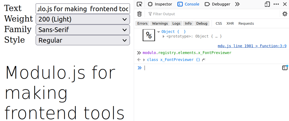
Let's create a font selector and previewer tool. A picture is worth a thousand words, so let's see the final result below:

This could form the basis of a theme customizer screen, or a template customizer, or maybe a user settings page. Alternatively, like the previous tools we looked at, it could be form the basis of internal tools for a design team, especially if one modifies it to only select from pre-approved font pairings or selections according to your style guides. Modulo.js is the perfect tool for this job. It's a tiny 2000 line framework with zero dependencies, and an online tutorial with a huge library of examples: ModuloJS.org/Examples
Starting out with a basic font-weight picker
This tutorial consists of several select boxes, and previewing the style of each. Let's start with getting font-weight to work, and then go from there:
Here, we have a select input. This will cause a drop-down selector to show in the browser. It's hooked up (bound) to a State CPart. We use the name="weight" attribute to tell the State CPart which state variable should be "assigned" (bound) to this input. The [state.bind] directive is what actually triggers the binding. Make sense? If not, to learn more on the State CPart, consider trying this interactive tutorial on the Modulo JS website: Modulo JS - Ramping Up Part 2: State
Now, the next step is actually making this "font-weight" style a paragraph tag:
See how the {{ state.weight }} is now in a style= attribute? This lets us preview the weight directly.
Tweaking appearance & adding custom text
Right now things are all misaligned. Let's add a Style CPart so we can style the :host (root element of the entire component) using a CSS grid styling so the <label> tags end up on the left and the inputs end up on the right:
Now, let's add the customizable text. We'll start by tweaking the p tag. Note that we also added a grid-column so it spans both sides:
Now, we'll add the new State variable & input:
Adding the remaining font selectors
Note that with these form fields, we are just following the same pattern as before. Binding to State is the same regardless of if it's a input or a select. This means we'll just "rinse and repeat for the remaining fields as well.
Examine the following code snippet. Do you see the pattern of how to make bound <select> elements in Modulo?
x-FontPreviewer: The Final Result
Once we repeat the same pattern of HTML code, and add the necessary CSS tweaks to the style= attribute, we end up with the final result:
Try it out now (30 seconds): Copy and paste the above code into an empty file, save with a .html extension, then open directly in your browser. I hope you enjoyed that tutorial!
🗣️ Comments
Commenting available on dev.to:
View Comments (dev.to) Creating a SVG-based Word Art curve designer
 Building a word art skew design tool
 Creating a CSS-based 3D extruded Word Art picker